Party of Two

Designed to Match Singles into Healthy Relationships of Two

With online dating, we rely on AI, which effectively filters and sorts out our possible matches. This saves us a lot of time, and possibly a lot of bad experiences with poor matches. So does AI really work? A lot of people seem to think so, and the millions of resulting relationships and marriages prove it. This result is what motivated me to create my project, Party of Two.

Deliverables

Responsive Web App Design

Responsibilities

UX Design, UI Design, Brand Identity

Tools & Softwares

Sketch, Photoshop, Principle, Google Suite, Draw.io, Usability Hub

THE PROBLEM

Nowadays, it's difficult to meet the right person just by hanging out in a public place or bar setting. Because of this, many people of all ages have started using online dating to help find their soulmates. But, online dating also has its challenges and frustrations. One of the big issues with online dating is the hook-up culture. Another problem is the abundance of fake profiles. For my Party of Two site, I worked to create a design with solutions aiming to solve both these problems.

THE SOLUTION

1. VIDEO CHAT FEATURE

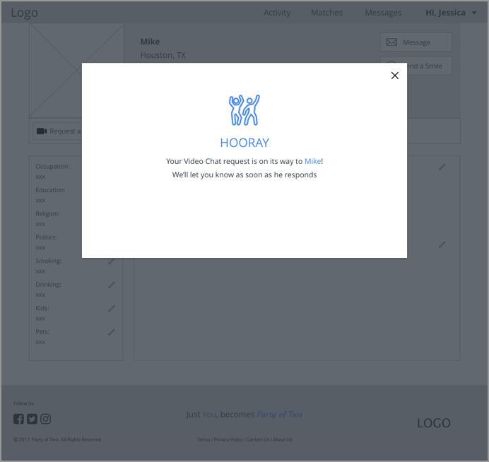
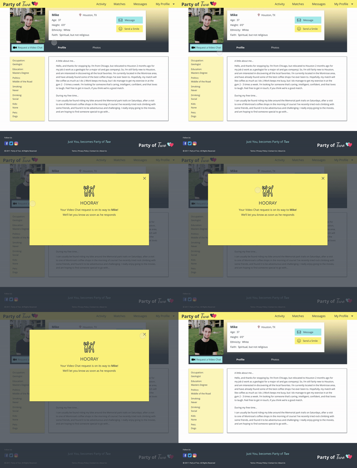
I created a video chat feature to not only allow the user to see the person they've been communicating with (and determine if they're real or not!), but also give the user more of an idea what they're like, before deciding to meet in person for a date. This is both a time and money saver, if the person on the other end turns out to not be what the user was hoping for.
2. DETAILED QUESTIONNAIRE

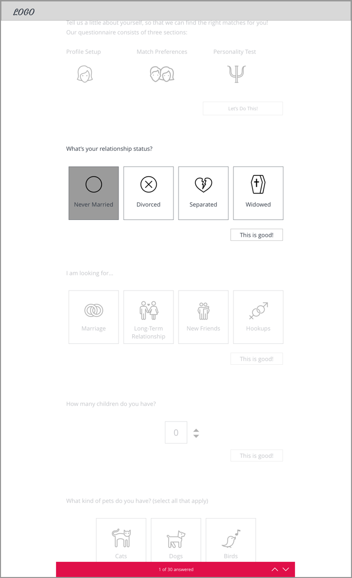
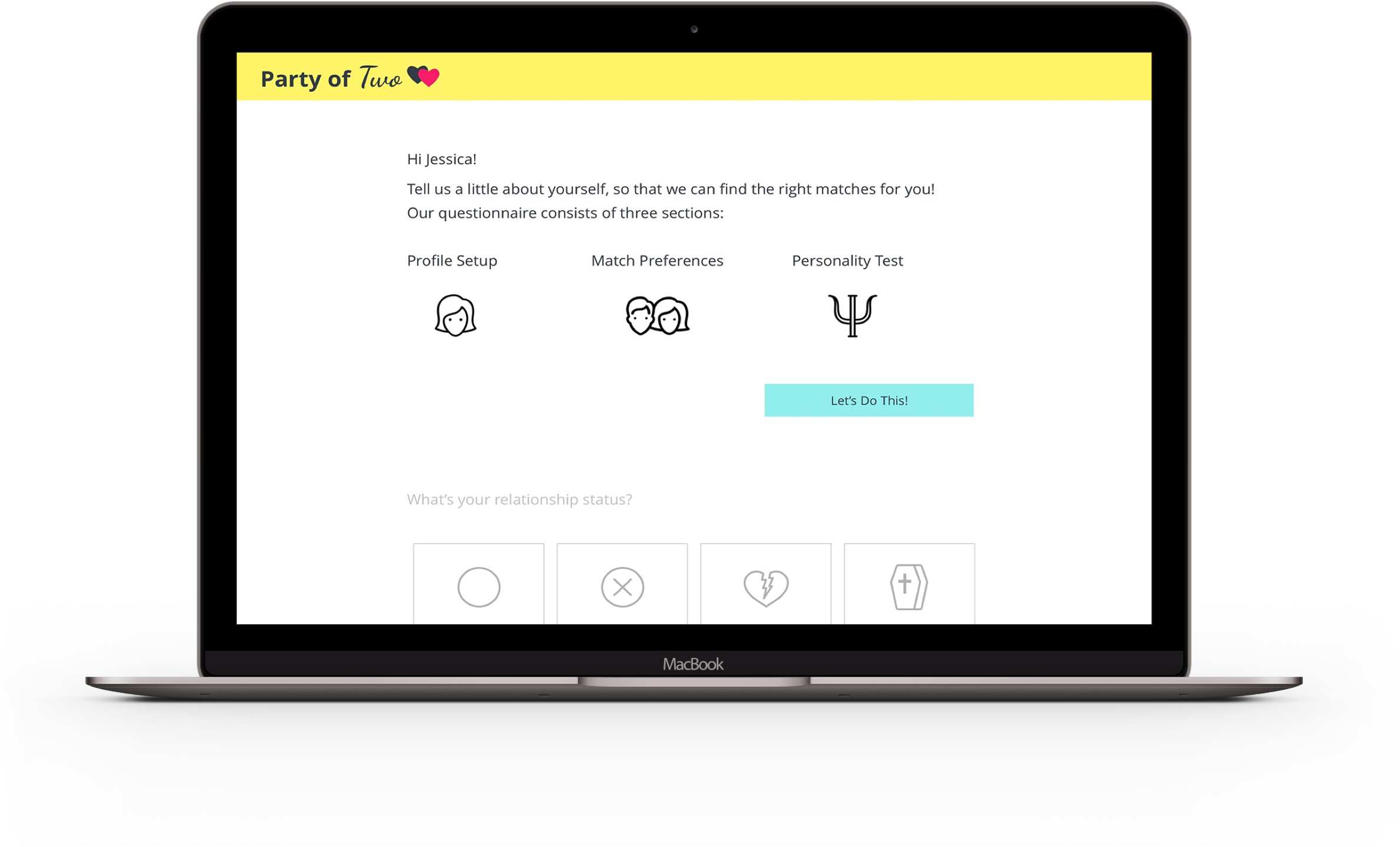
To help with the hook-up culture, I felt a detailed questionnaire which covers the user's match preferences, commitment level, and personality, is necessary. It would eliminate the need for endless filters, and thousands of matches to search through.
Brainstorming

I began brainstorming, and drew a mind map to create a visual relationship between the ideas, thoughts, and words of online dating. I wanted to have a fun, yet classic feel to the site, and decided to name my site "Party of Two".

Survey

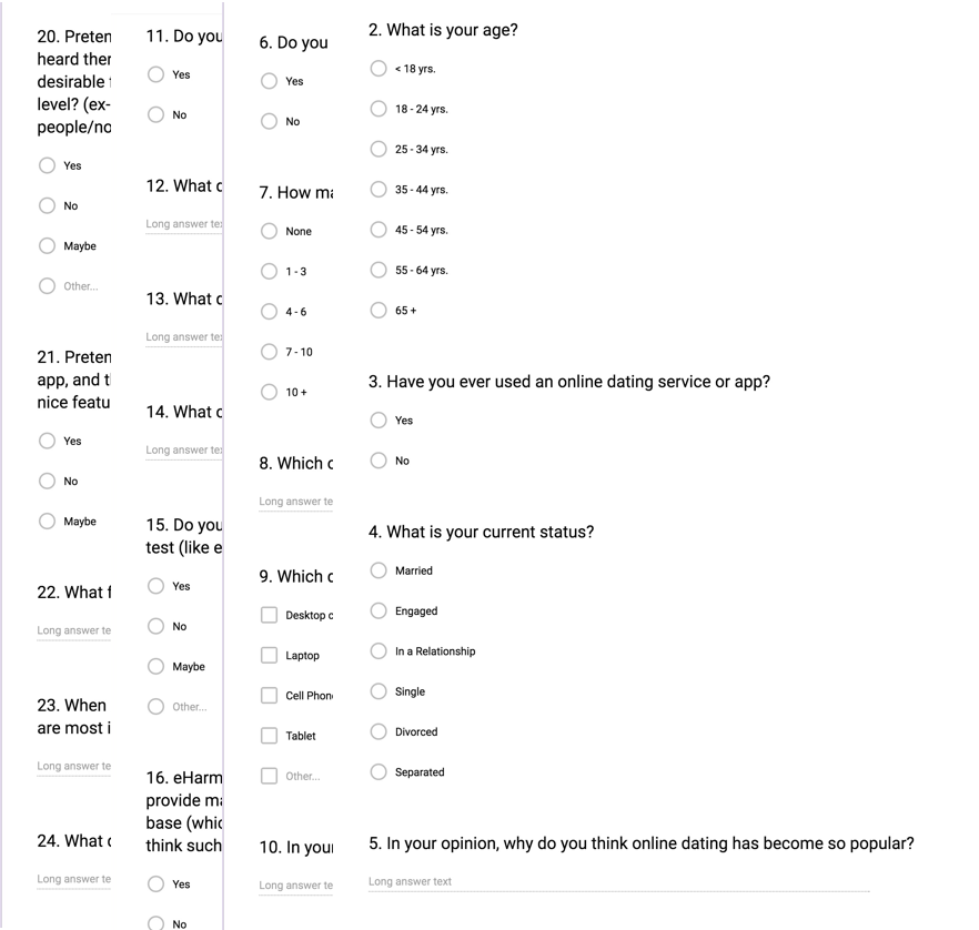
I aimed to design a site based on my user's needs, so I put together a survey to find out what other peoples' goals and frustrations were with online dating sites.

Based on my survey, 77% (of 34 responses) felt online dating sites need improvement, and wanted to see the following requests/changes:
-Filter out people only looking for hook-ups
-Match people with same commitment levels
-Improved matches
-More personality test
-Better filtration to remove fake profiles
-Limit the number of profiles users see daily
-Only matches can communicate with each other
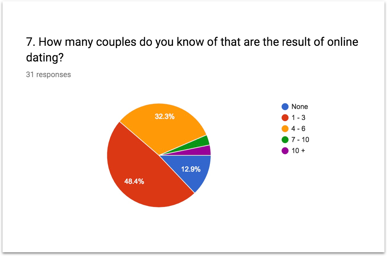
87.1% of the responses knew of couples that resulted from using online dating sites
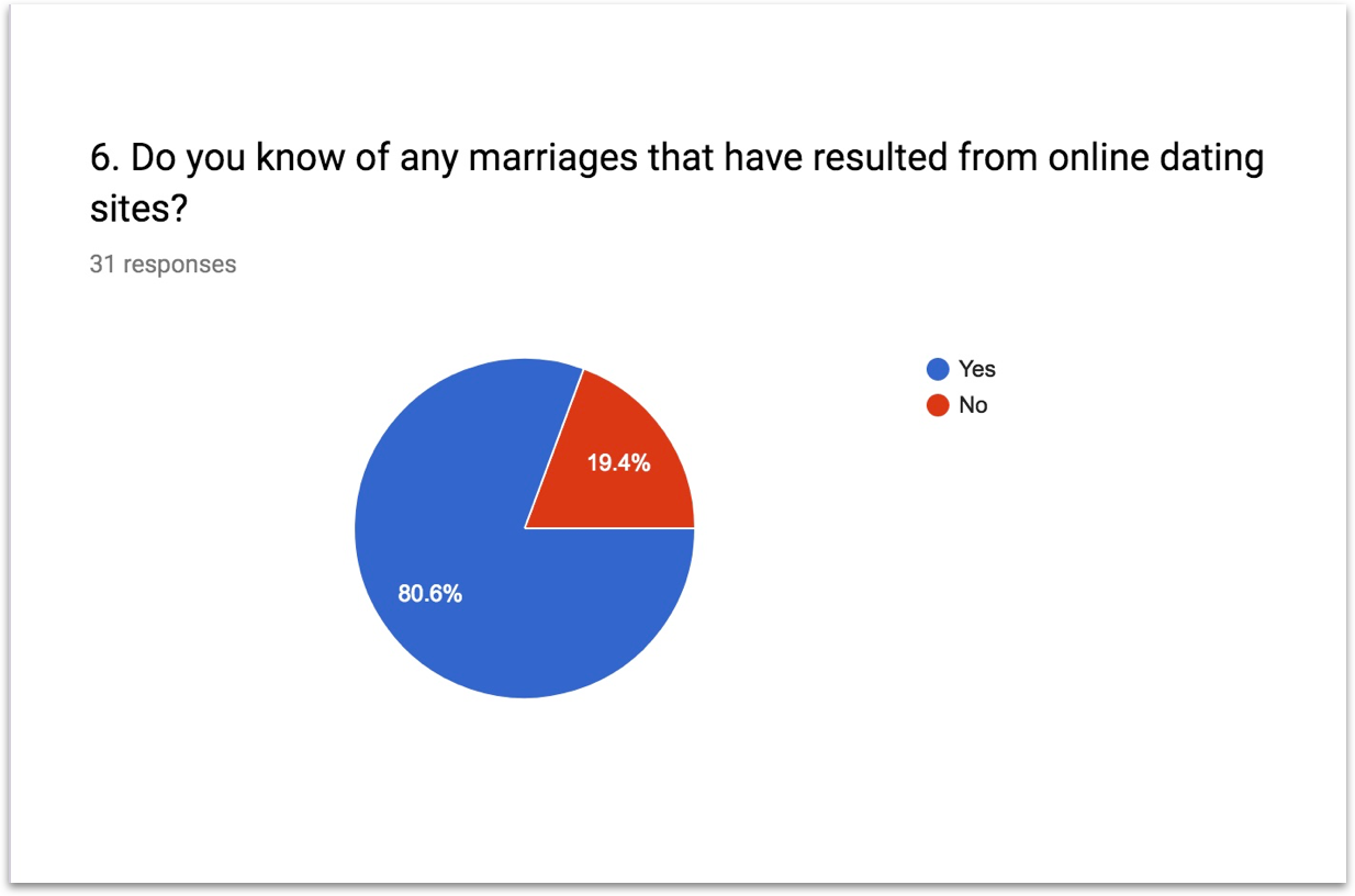
80.6% of the responses knew of marriages that resulted from using online dating sites
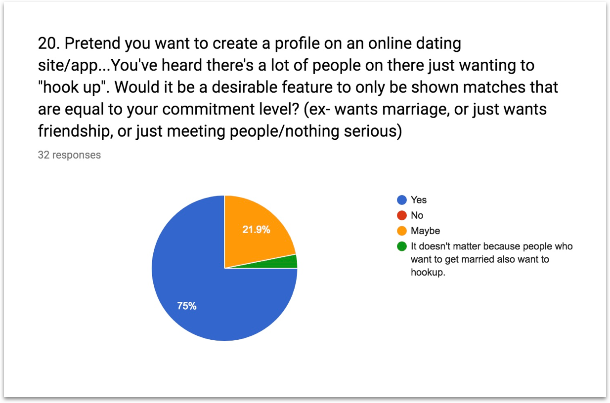
75% of responses wanted only to be presented with matches looking for the same commitment level in a relationship
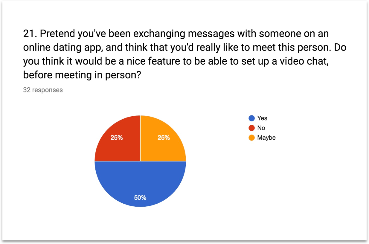
75% of the responses felt my idea of having the option to a video chat before meeting in person might, or would be a nice feature to have

Personas

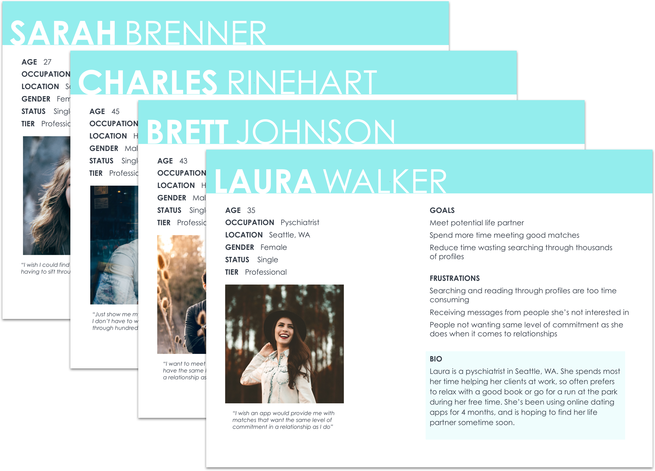
Compiling the results from my survey, I selected a few of the responses to interview with. I used these interviews to create personas, which helped to guide and keep me on track with my user's needs, as I designed the Party of Two site.
SWOT Analysis

To understand my competition, I conducted a SWOT Analysis on 3 of my possible competitors:
match.com, eHarmony, and Zoosk
Based on my SWOT analysis, I decided to focus on the following opportunities:
-Use a simple, less overwhelming search base
-Create a detailed questionnaire for the new user to help provide good matches
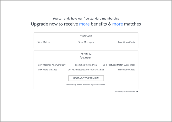
-Make memberships reasonably priced
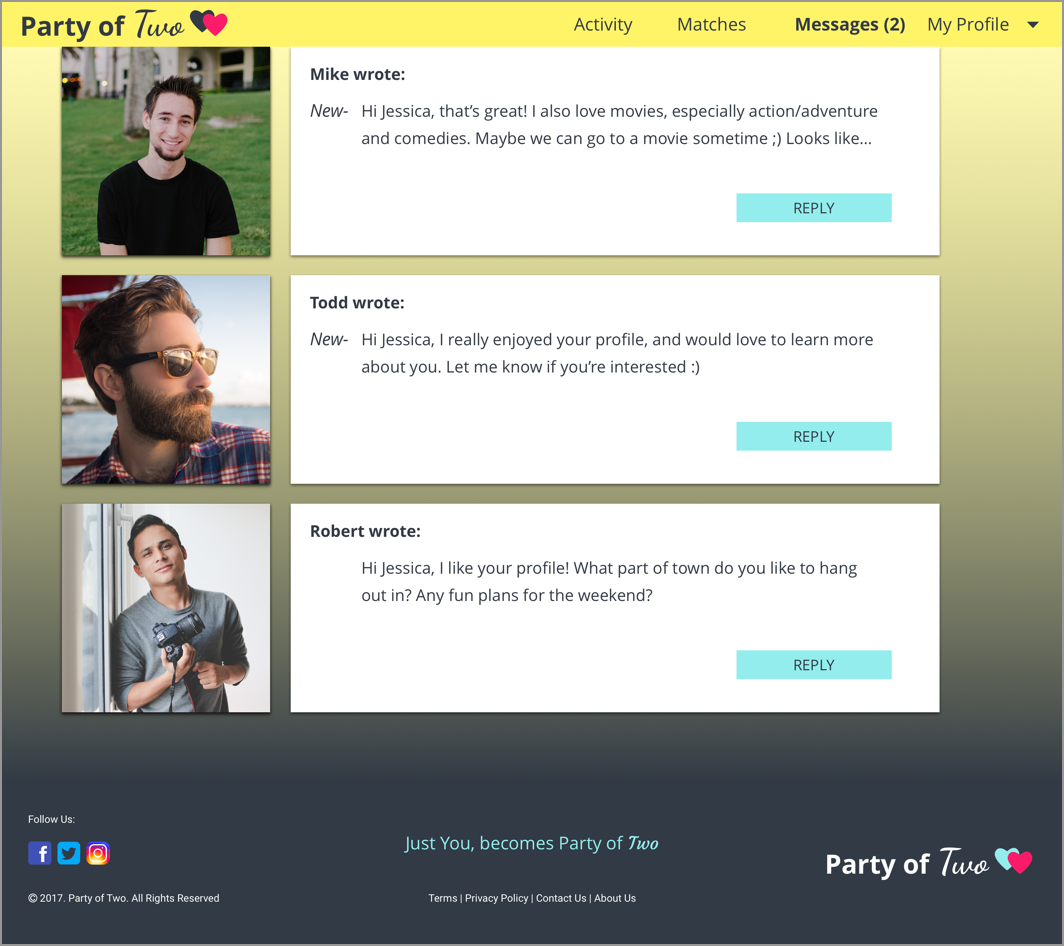
-Allow communication only between mutual matches

User fLOWS

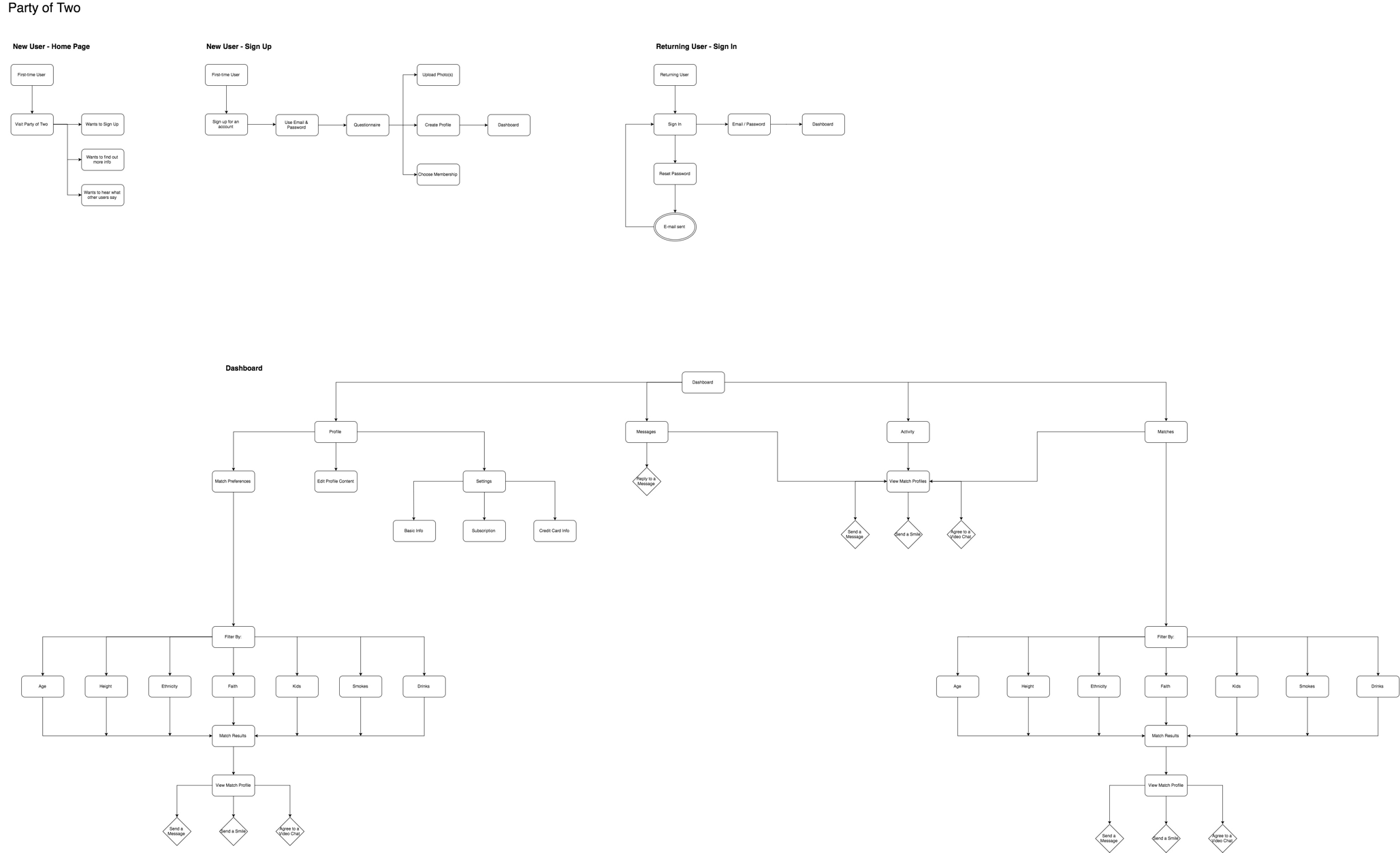
User flows help to keep my workflow organized and on track. I created the following user flows with the MVP's from my user stories:
TESTING

Navigation is important for every site, especially when you're trying to accomplish certain tasks on an online dating site! ;) I conducted usability tests to make sure new users understood (with a quick glance), what kind of site Party of Two is, as well as simple navigation tests.

Wireframes & Mockups

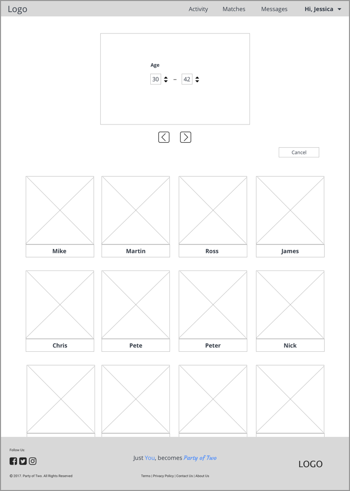
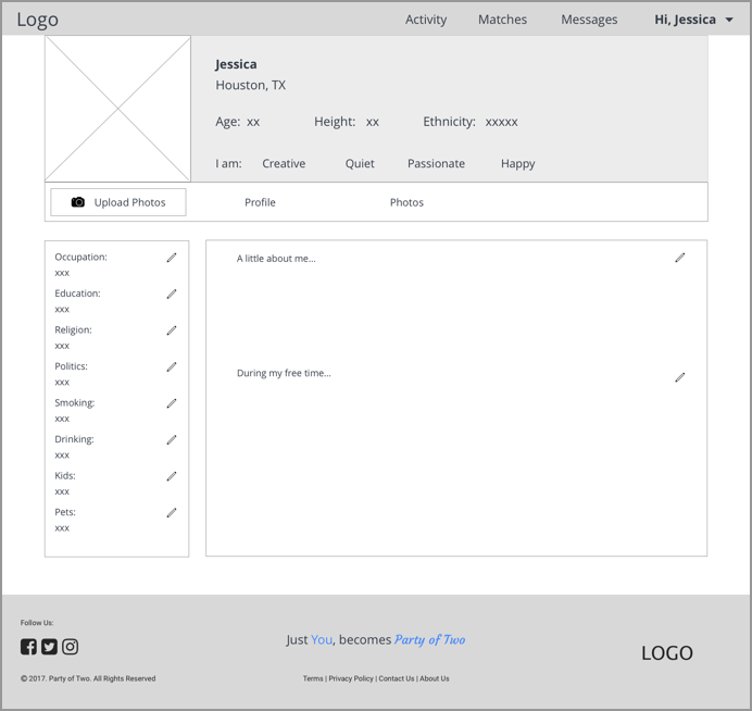
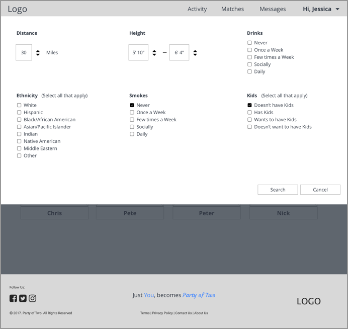
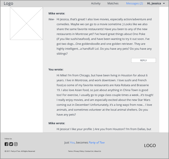
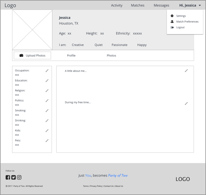
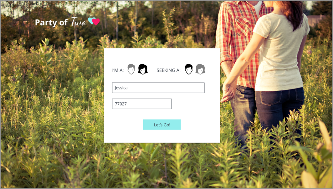
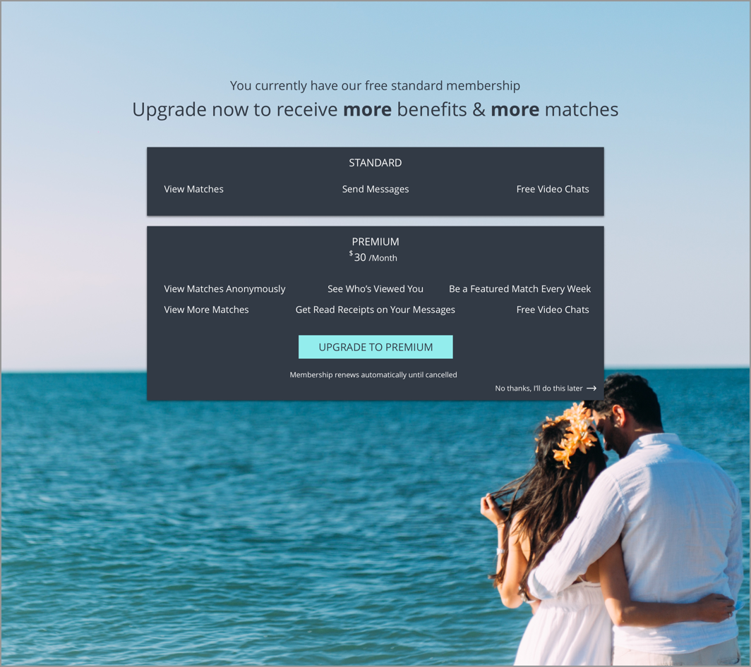
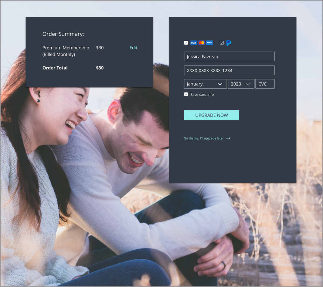
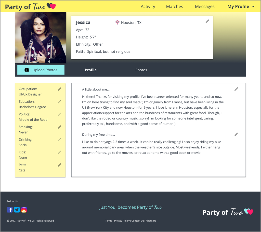
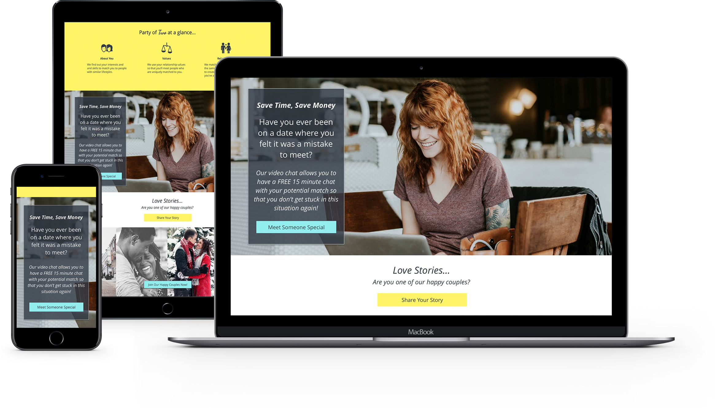
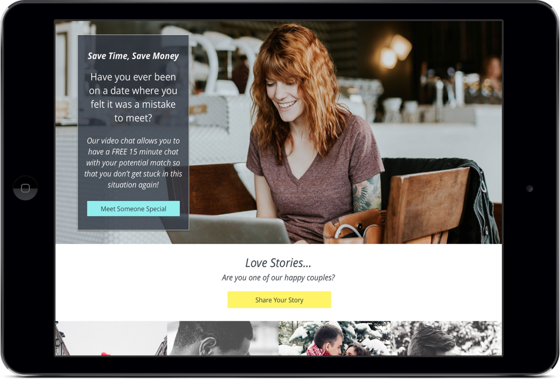
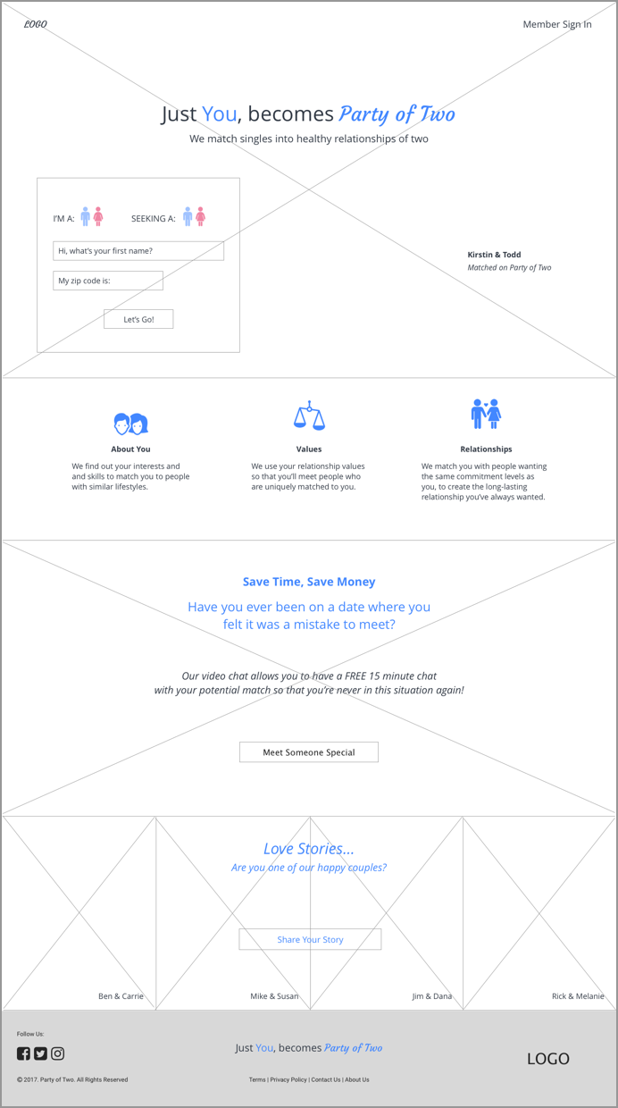
Using Sketch, I created low-fidelity & high-fidelity wireframes and then designed mockups
Some examples shown below:

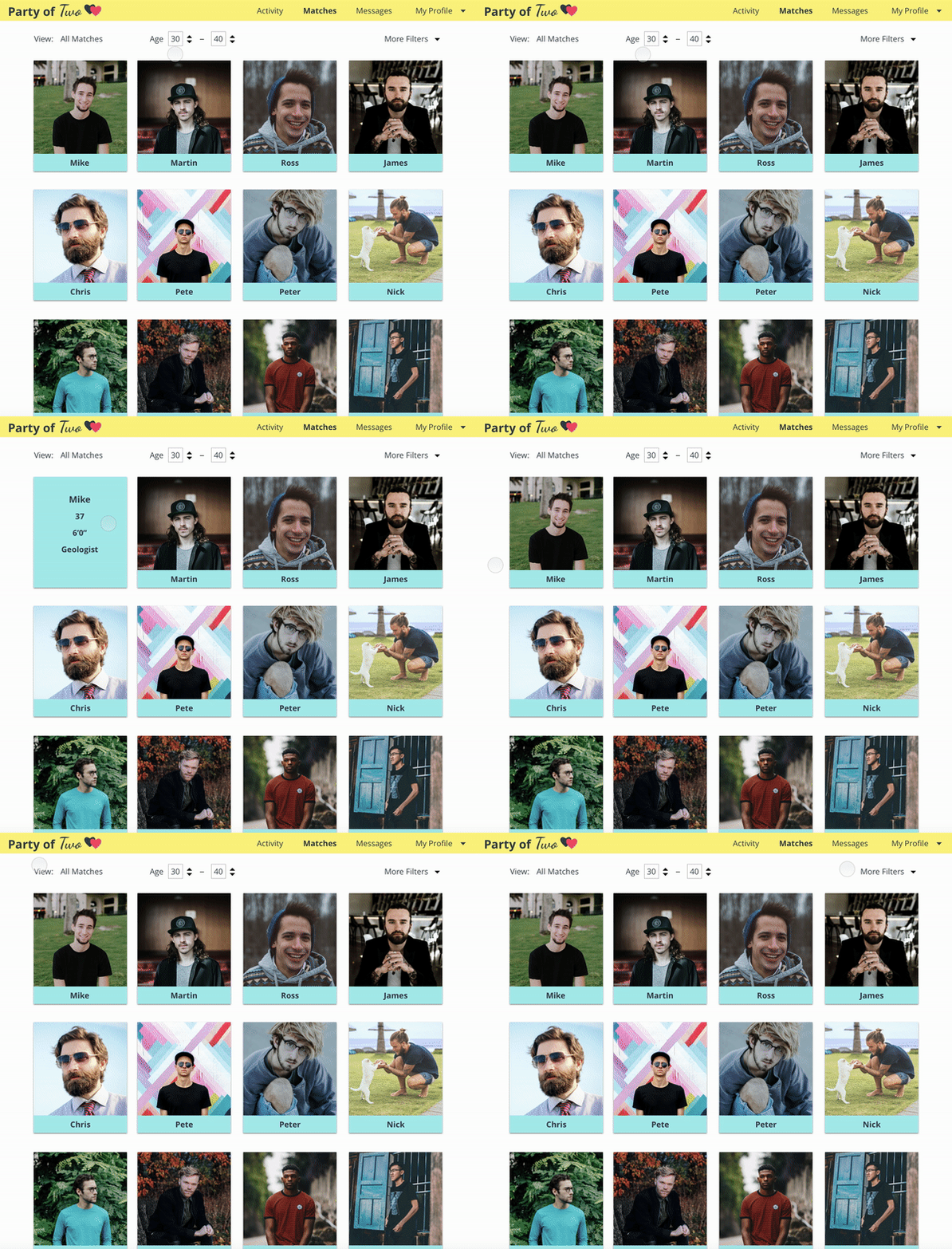
SAVE TIME BY ONLY CLICKING ON PROFILES YOU'RE INTERESTED IN

Simple details show when the user hovers over a match's card gives the user an idea on which match profiles they want to view

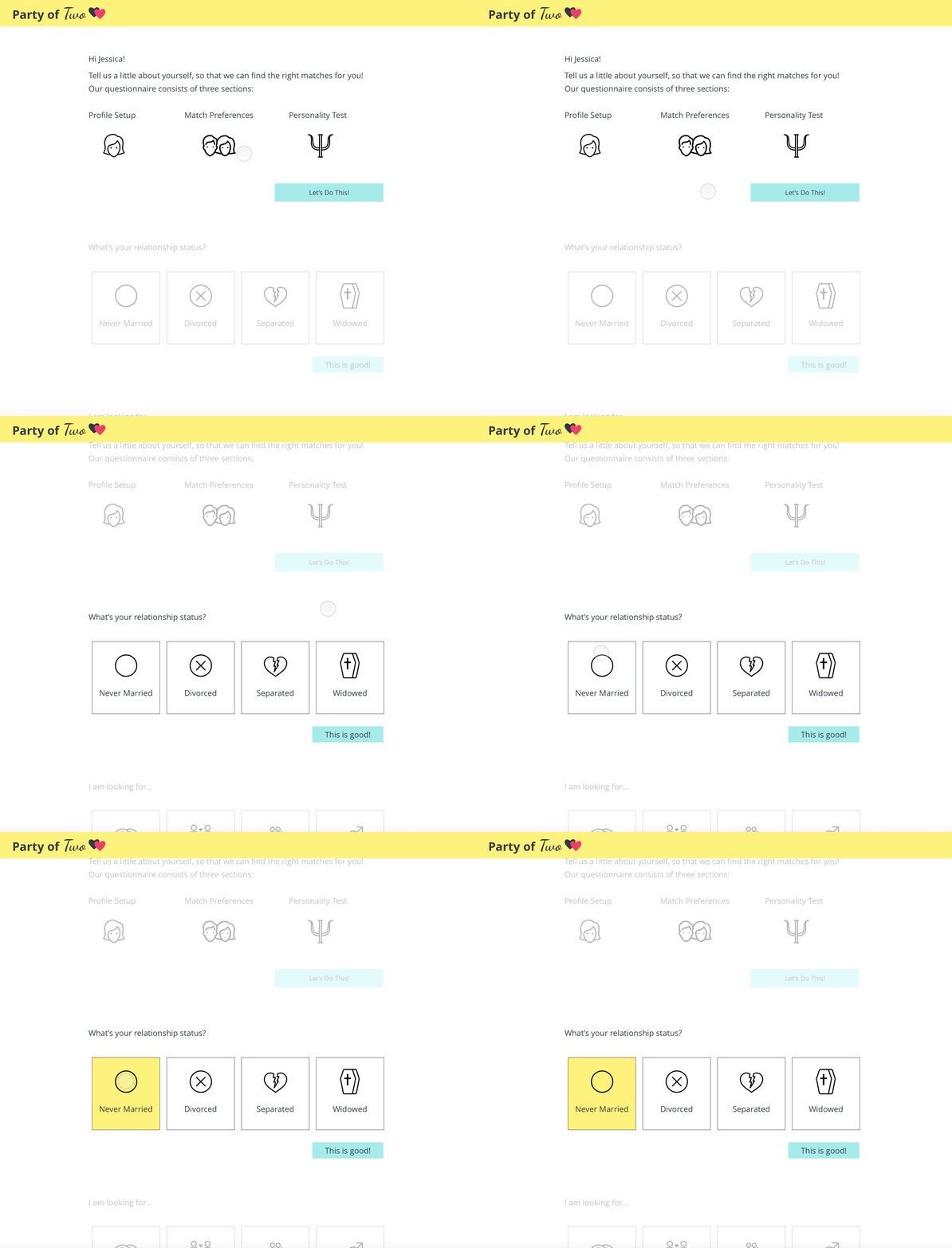
MATCHES CHOSEN ESPECIALLY FOR YOU

Detailed questionnaire eliminates waisting time searching through too many poor matches, and helps to prevent a hook-up environment

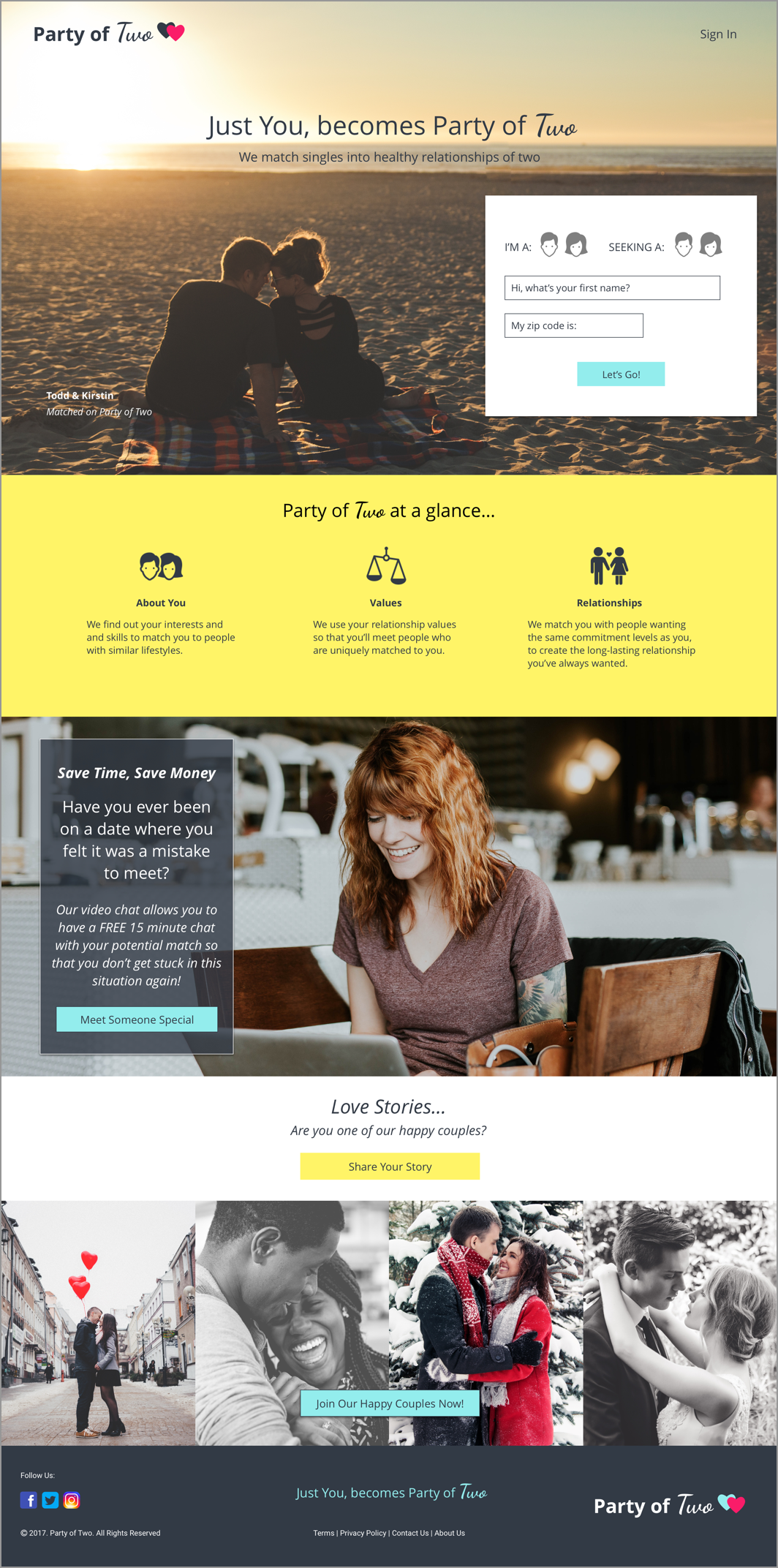
SAVE TIME & MONEY WITH VIDEO CHATS

No more wasting time & money on poor matches. Free video chats allow users to see what their matches are really like before meeting for a date!

FINAL DESIGN

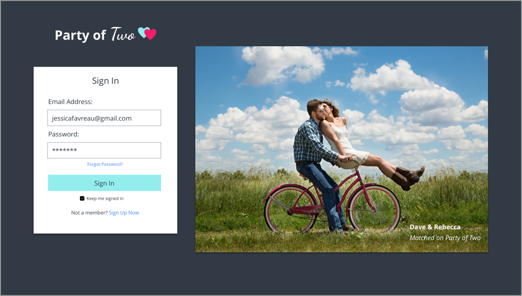
For my final design, I used Principle to create an animated prototype:

BRANDING

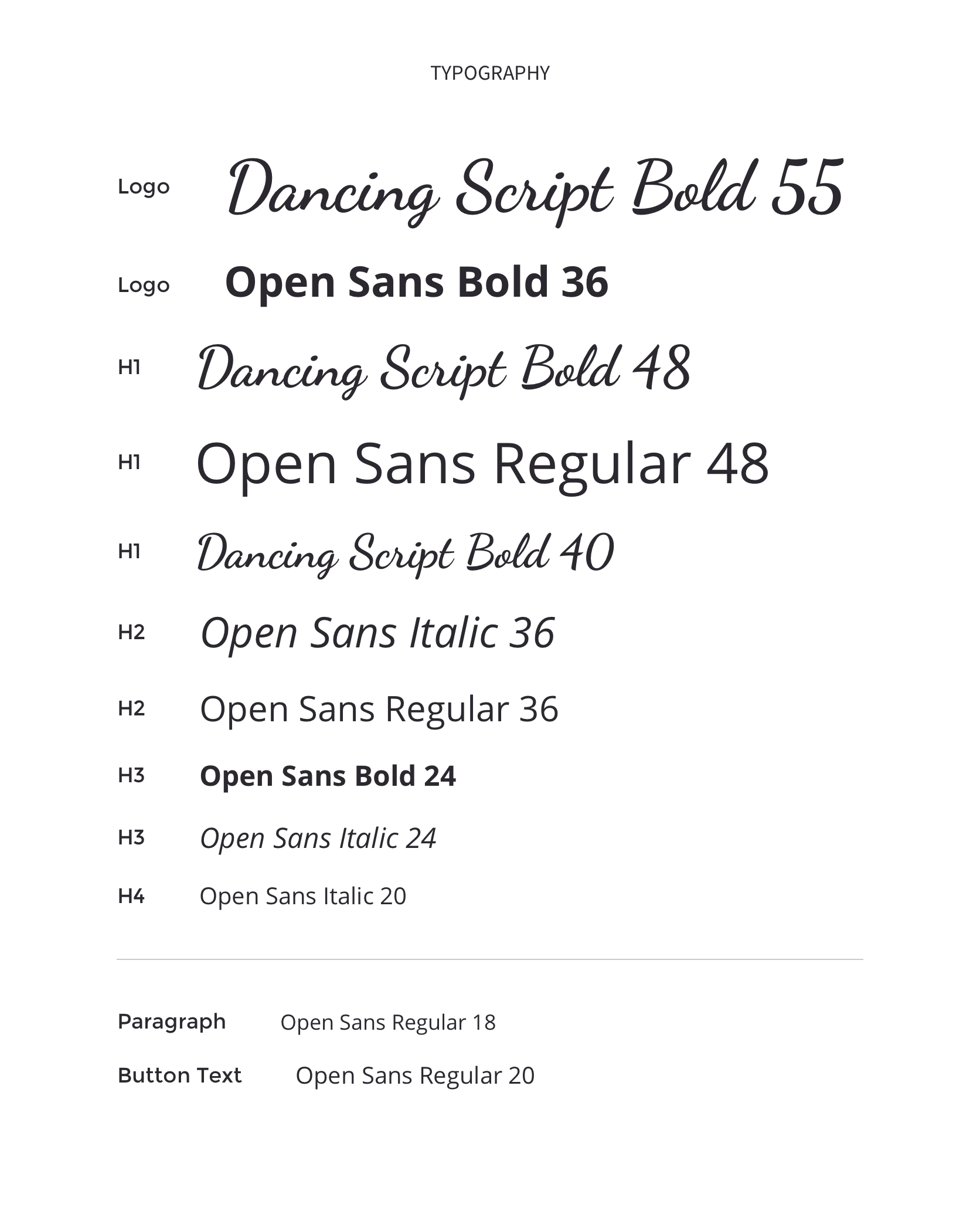
I wanted Party of Two to appear attractive and engaging for my users. Creating a color palette, I was careful to choose colors which would give the site a gender-neutral look:
I gave the logo a little pop of color:
For darker backgrounds, I integrated the same blue used throughout the site:
Contact Me