
Alisa Matthews Photography is a website which showcases my photography work consisting of landscape/nature, portraits, fashion, and lifestyle/family photos. Photography is more of a passion and hobby for me, rather than a profession, so the main purpose of this site is to display my work in a beautiful and inspiring way. View the redesign of my photography site here:
www.alisamatthewsphotography.com
Alisa Matthews Photography has no brand identity. The site is also using a template on Weebly, which is very limiting for design, and can often be non-responsive when viewing photos.
Create a logo, color palette, and select typography which will give Alisa Matthews Photography a unique and attractive appearance, and help to make a memorable experience while viewing photos on the website.

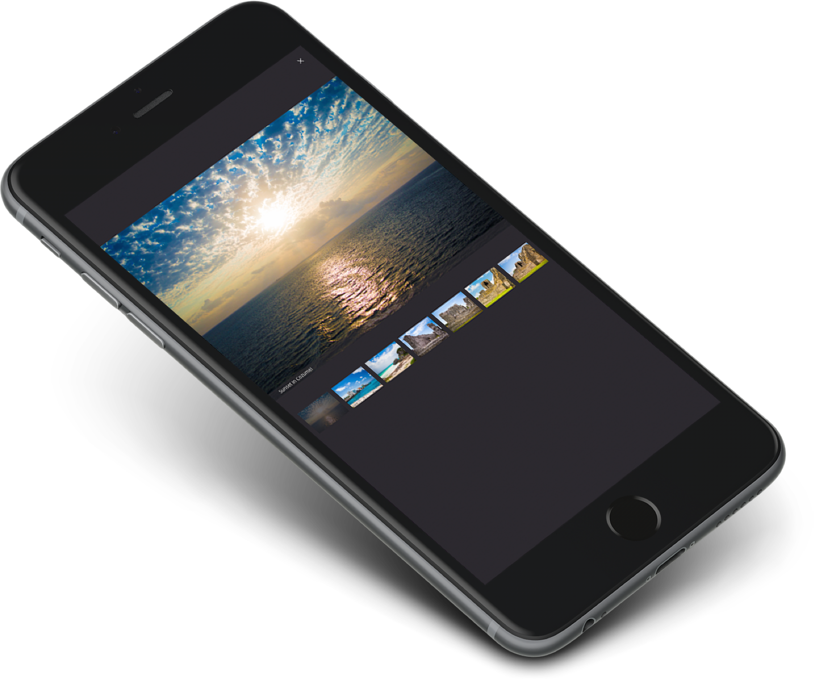
Design the site so that it's responsive and allows users to view photos on mobile devices.
I began brainstorming, and drew a mind map to create a visual relationship between the ideas and thoughts that came to mind with photography. Giving it some thought, I decided that I wanted to use my name as the name of the site (rather than an abstract name) so that viewers would know who's work they're viewing.

I conducted a survey to help decide which logo would be best for Alisa Matthews Photography. During my research, I discovered that the word photography comes from the Greek roots meaning light and the representation by means of lines and drawings, together meaning "drawings with light". Using the "drawings with light" idea, I created some abstract logos. Keeping the logo simple, I also tried different variations using my initials.
Based on my survey, a logo with my initials turned out to be the best, showing a modern, attractive, and unique branding to my site. In fact, I ended up liking the logo with my initials so much, that I eventually decided to use it for all my personal websites, including this one ;)


